Thursday, December 10, 2009

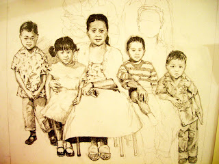
Xmas Gift - Work In Progress


Here's a WIP of a Christmas gift for my extended fam in Hawaii. It's about 7 hours into it, and I figure should be done within a few days.

The photo is of my grandparents (centered) and my dad and uncle when they were kids. It's a great photo. Hopefully I can do it justice!

Tuesday, November 10, 2009

Playing card deck


Sorry, I HAD to post this pic again; I'm re-inspired to do a whole deck of these with a buddy of mine!

Wednesday, September 9, 2009

Wednesday, August 26, 2009

Southern CO Ford logos


I've been tasked to help create some logos for all the Southern CO Ford stores.

Here's my submissions that made the cut.

Tuesday, August 4, 2009

Ford Commercial

So, my Ford commercial will most likely get produced, but I'm not sure if I can post up any pictures legally. Grr. This is so frustrating!

I really love what I have to show, but I have to keep it internally, lest I get in trouble from the MAN.

As always, I'll keep ya posted!

Friday, July 24, 2009

New Ford commercial?

Awhile back, I've developed a concept and some keyframes for what I thought would be a cool Ford commercial.

It got a GREAT review by the Northwest board of directors, so there's a great chance it'll be turned into an actual commercial!

I'm not sure what the rules are for posting the actual keyframes, but I'll keep you guys updated on the status of it!

I'd love to be the art director on this!!

Monday, July 13, 2009

AFO Playing card/skate deck


I'm designing my own skatedeck, with this playing card as a center-piece. On the skatedeck, it'll have the Mexican flag in the background, along with some ribbons and a headline that says, "Viva La Art Farce One" and "Aces high". The whole thing will be punctured by bullet holes.

I thought a Mexican bandito theme would be cool, yo!

Friday, June 12, 2009

Mother's Day Flower


Here's a digital painting I did of a flower. It was originally for Mother's Day 2009. The first version had "Happy Mother's Day" below the flower, but my creative supervisor told me it would look better with it off. Which, sadly, it did.

I've included my early flower sketch and some various stages throughout the painting. Also, I've included my latest portfolio layout, which I'm immensely pleased with. That layout is like the seventh version. I'm starting to see what my friend Dustin told me, regarding layouts: "Less is more." I thought you had to fill your portfolio with a ton of cool things, but he's right.

I painted this in Photoshop. For those who don't know, I drew the sketch in photoshop with my flower reference handy on my other monitor, and slowly built up the colors of each petal. I crudely drew in the background greens and browns and gaussian-blurred them.

Wizard Room


One of my first Art Institute of CO projects was to make a "Wizard Room" for Background and Layouts Class. This is my third version of it. The original was done over two or three years ago, but I think this version stands up the best. I think there's a lot of fun, small things going on in the picture, kind of like a "Where's Waldo" book. For instance, why is there a "Bush/Cheney" sticker on a conquistador helmet, or a flaming shish-ka-bob arrow? And a dolphin's head mounted on the wall? Was that THE crossbow used to bag the dolphin? Oh, and the Dr. Evil bear makes an appearance.


Come to think of it, I don't remember learning jack from background class. Argh! Damn you, Flanagan!

Wednesday, June 10, 2009

Windy/Concrete Jungle


My illustration a year ago when I hated life and going to work and it was cold and I felt like I was dragging ass.

My resume!


I worked hard on my resume last night. I designed AFO dogtags in Photoshop (God, they look awesome. Lol.) to add as a graphic element in my resume, and I think my resume actually LOOKS like a designer's resume now.

I'm going to post a photoshop tutorial on how I made those dog-tags. It's actually kind of easy, if you know 'shop. It'll be my way of giving back to the artistic community.

Tuesday, June 9, 2009

Mah Montana F150 poster


Here's a poster I made for an up and coming open casting call for a Ford F-series commercial. Since this isn't a national print-job, and it's not being published for anything other than inviting people to come in and talk, there shouldn't be a problem posting this up.

I really like it, so that's why I'm showing it.

Ask an' you shall receive!

It's no secret my internship is almost up in July/August here at JWT.

It's kind of scary at this point, because I've got friggin' medical bills to pay, student loans, orthodontic work to be done, parents to help take care of, 401 k to invest in, money to set aside for a family....GRRR! And I'm livin' in a highly competitive, sucky economy here in Denver, CO.

I'm reading this book, "The Artist's Way," about unlocking your inner creativity and finding the right path you want in your life. One of the chapters tells me to simply ask God, then be alert for signs. (God being whomever your deity is, or if you don't have one, the universe. All that's good. That guy.) So I do. I ask to find a great job that I'll be happy in, that'll lead me down the right path, that'll pay me well with benefits, and won't stress me out. It's a little weird, because I'm kind of skeptical about such things, and wouldn't consider myself a God-fearing individual.

A week later today, I get an email from a career counselor from AiC stating that the Rocky Mountain Institute, an uber-smart think tank in Boulder, needs a designer/editor/animator for a full-time position. RMI is an organization that does great things for the environment and is run by egg-heads and other smart people. I would love to work for people who stand for something. So I get to work (secretly) on a cover letter and my resume at work. Will I get the job, or something similar? We'll see!

But I DO want to thank God, Buddha, Allah, the universe, whomever for these incredible opportunities. If you're listening, I'm incredibly grateful to you.

Thank you.
ART FARCE ONE Mag Cover


If AFO was an art & music magazine, this would be one of the covers.

I've also included my portfolio layout, because I was too lazy to take it out. It's amazing what typography can do to an illustration.

I should also add that the original illustration was one I did for my friend Dana Herrmann, who's been one of my most supportive friends EVER. Hope you don't mind, Dana, but I took the illustration I did for you and turned it into a magazine cover. But I'm uber-serious when I say that I drew and painted that artwork just for you. You're the only one who'll have that hanging on their wall. If that means anything. Lol.

Monday, June 1, 2009

Iron Angels - Unit Patch


My final unit patch...the Iron Angels logo. The Iron Angels, a fictional search an' rescue/combat medic team that risks life an' limb for the good of their comrades. I tried to come up with a really cool, honorable logo that combines the selflessness of an angel + a medic team, with the rustiness, dirtiness of war.

This one was really tough to do...iron is this ugly brownish/red color, and angels stir up thoughts of sky blue, golden haloes, and angelic white. How the heck was I gonna balance these two out? After like 9 different versions, I finally came up with a solution I was happy with. Instead of choosing a rusty appearance over a more "heavenly" one, or vice-versa, I said, "Eff it! Let's do both." The top version is a sketch of my idea, the middle one is an early stage one where I was experimenting with combining rust + nice metallic metal, and the last one is my final.

I added a reflection of a sky/sunset to the wings and "Iron ngels" to give it a metallic reflection look. I loved doing this logo, and I think out of all four of the ones I've posted, it's my most successful, as far as appearance and the final solution.

I put the whole thing against black to make it stand out more, and I tilted the halo to give it a more "casual" look.

Friday, May 29, 2009

Comic Cover


If I had a comic book, this might be one of the covers. It features my Welcome to Southtown dudes, Brian (the brown one) and Ethan, the condom-y one.

Then I make a little cameo in the background.

Thursday, May 28, 2009

"Anton, WTF is 'Colonies'?" Or, "What's the deal with those logos?"

"Colonies" and the logos pertain to a super secret (not really) project that I'm currently developing. It's this idea that's been in my head for like a decade, but never moved on. I can't really go into it without divulging a ton of information, or without sounding like a total nerd, but rest assured, I'll keep posting sketches up.

Stay tuned!

UNHoly Rollers Unit Patch


I like the idea of the logo, but I'm not entirely happy with the execution of it. I might redo it. I stole the red triangle from the "Brotherhood of NOD" logo. I'm not digging on the look of the tank. And the "UN" looks like ketchup. Lol.

Again, the idea is there. The unit's motto is "Hell on Wheels." The UNHoly Rollers name comes from the Simpsons' Holy Rollers bowling team.

I was debating putting in an upside down cross, but I don't wanna offend.

Ammo Kats - Unit Patch


The Ammo Kats is a fictional ordinance, ammo, and supply unit. I kept imagining an insane cat holding dynamite, with burned fingers and bandaids. I chose black for the cat because that symbolizes bad luck, especially when holding dynamite.

The word Ammo Kats comes from my buddy Alfred's Toyota Tacoma truck. "Tacoma" spelled backwards is "Amocat." I thought that would make a cool name somewhere someday.

Ground Pounders - Artillery Unit Patch


Eric and I's "Colonies" Ground Pounders Unit Patch. The Ground Pounders are a fictional artillery unit. I chose a shield because they protect units on the field, and thunderbolts to symbolize steel rain.

Boom!

Friday, May 8, 2009

Comic Page


My first comic page, in like 15 YEARS. I haven't done a comic page since my buddy Eric and I did comics about pirates and hockey players and what-have-you.

Tuesday, April 21, 2009

Robin Sketch


Here's a digital painting I did of a robin, during work when it was SLOW.